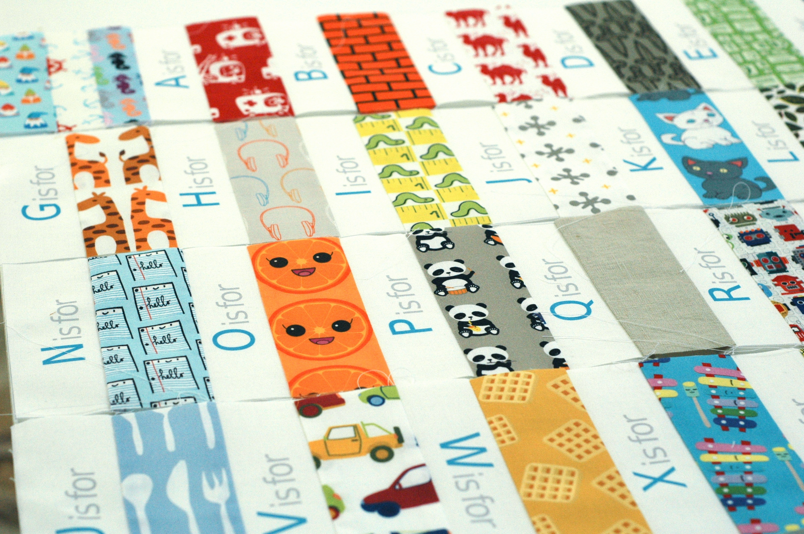
With much enthusiasm, I’d started piecing my alphabet labels with corresponding fabrics here. They started out in strips that I thought I’d stitch together in rows, like this:
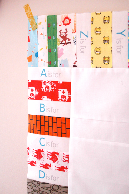
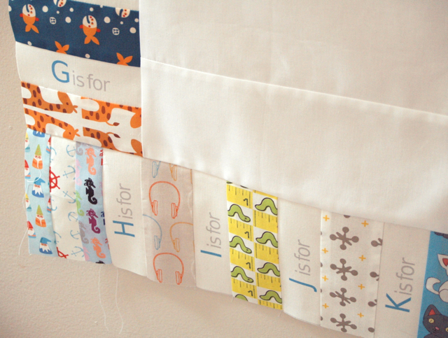
But after I’d put it aside to work on a few things for Mary and Matt, finish a quilt for my cousin’s son, fix up my kid and manage Spring Break… I pulled it out again and realized that for my first version of this I’d rather run them in a rectangular loop. So here’s where I am: (Yep, I know the W is backward– it was a mistake, but then I decided to keep it because I was indecisive and then realized that I was *waffling* about it. Thus, it must stay. It’s the sort of thing K and I could talk about for a good hour.)
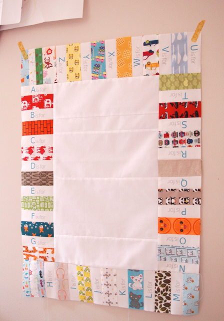
I have a simple plan for quilting the somewhat randomly pieced center area. I’m digging it so far. Here’s a closer look:
And… DOH! Totally put that spacer square in the wrong corner. I hung it on the wall, took photos, uploaded and edited them and… NOW I realize that it’s backward. There’s supposed to be one on the upper left and one on the lower right. Oops. Well, fortunately, it’s fixable and it doesn’t keep me from asking the question I want to ask.
So… my question is, am I being silly to picture it with a border much like what I did here, with the skinny frame, another wide white border and then the binding? Or should I do one wide colored sash and a similarly hued binding? Or something else entirely? Tell me what you think.

I love the skinny frame, white border, then binding. But I think that it works so well on the first one because it kind of calms down from all that’s happening in the center of the quilt. Since this one has that peaceful white center, I think doing another white border might be kind of jarring, if that makes any sense. So my vote is one wide colored sash and similar binding. BUT like I said, I love the first one, so you pretty much can’t go wrong. Can’t wait to see what you go with!
I think it would look lovely with a border similar to the I Spy quilt!
What ever border you put on it it will look great. This quilt is so stinking cute and that fabric is awesome—especially with the white.
liZ
It’s BEAUTIFUL!!! For this one I would suggest a colorful border, but nothing too bright to take away from the letters. Doing a white binding to bring the middle back out to the edges. I can’t wait to see the finished quilt!
This question plauges me every quilt I make! Especially if the size is perfect and I don’t need to make it any bigger/ longer. I think a white border an then a biased tape made from all the “letters” would be wonderful ( but maybe a little bit of leg work). Good luck!
Funny, we’re dealing with the same challenge this week. I just finished sewing my wagon wheel squares together and stumped on where to go from here. I agree with Jennifer about the white needing to come next. I’d go with a fat, white border, then maybe the skinny colorful one and a white binding.That way the focus will be on the letters and corresponding fabrics.
I’m loving the I-spy rectangle around the pieces white center. I can’t wait to see how it all turns out!
Me too. Ha! Susan
I Loooove your quilts! I think a skinny border in a coordinating turquoise color (matching the alphabet letters) would be cool, and then some sort of print featuring red (like this one I found on spoonflower…rainy dot red http://www.spoonflower.com/fabric/455668) around that, then the binding in the same turquoise.
Whatever you end up choosing, it always looks so fab. :-)
Holy moly. You’re so sweet! THanks! Wait, Did my husband pay you to make my day?!? Off to consult our bank records. Susan :)
This is so cute! I think your W is upside-down, though.
I love this! I like your plan for the border.