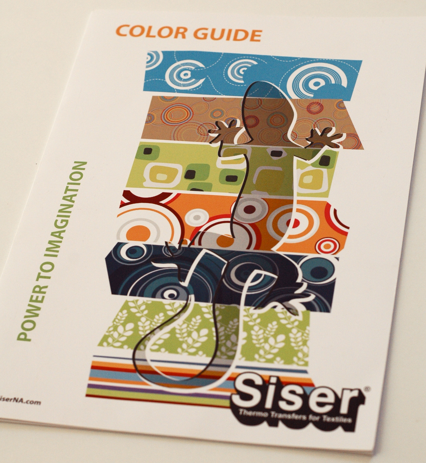
There’s this happiness most of us had as kids. The brand new box of crayons. Crisp edges. Sliding the top open. Peeking in at all of the perfectly formed, smooth waxy edges. The moment of decision. Where do you start? Which would be first? Later, the same joy with colored pencils and markers. A blank piece of paper and a whole box of amazingness waiting to happen.


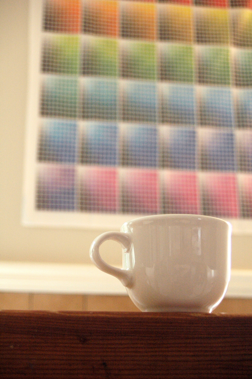
It’s easy to get distracted by it when I have coffee in the morning. Or any time I walk past it, really.
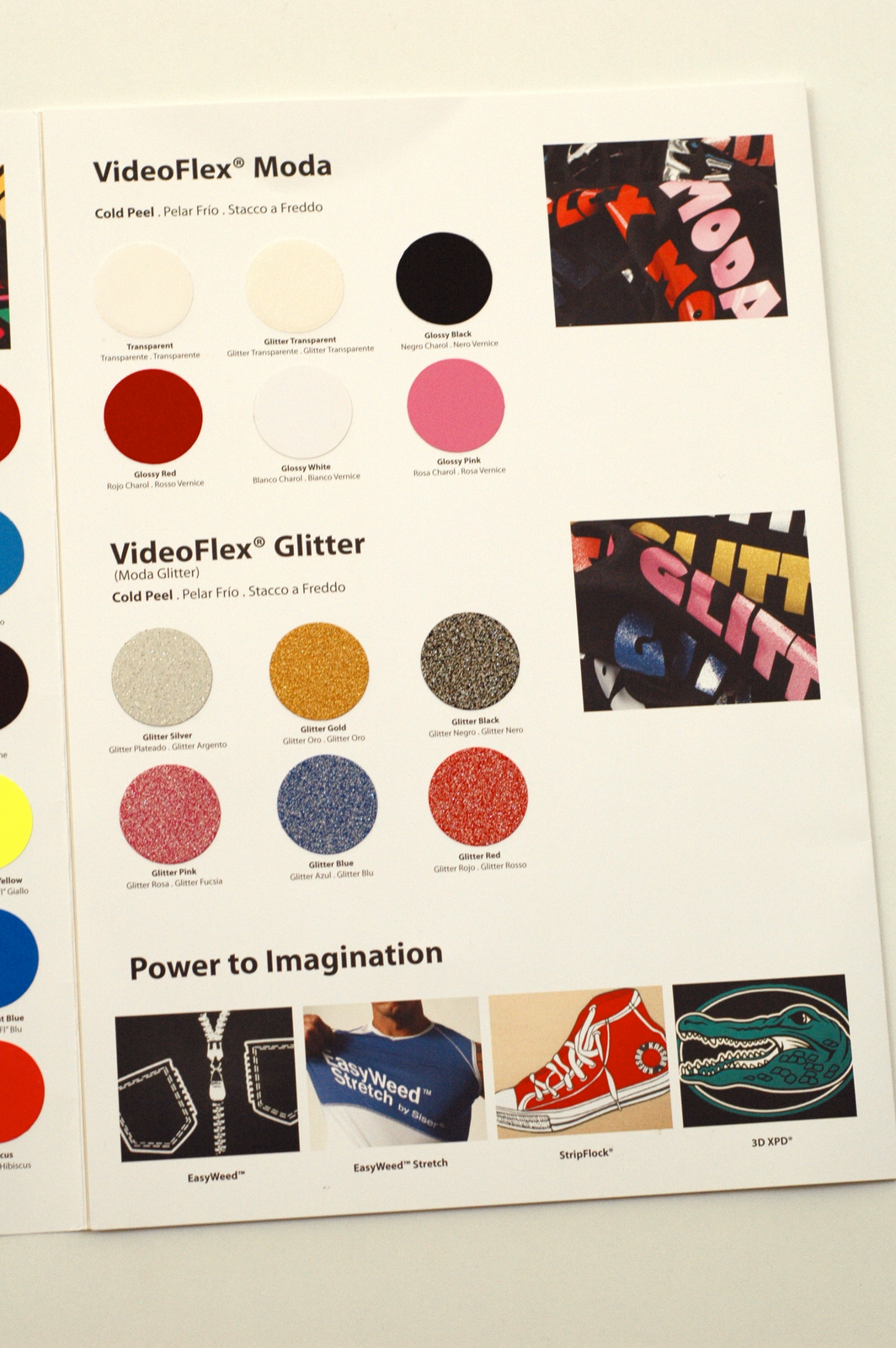
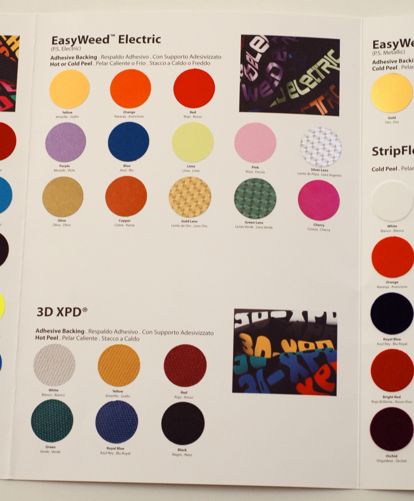
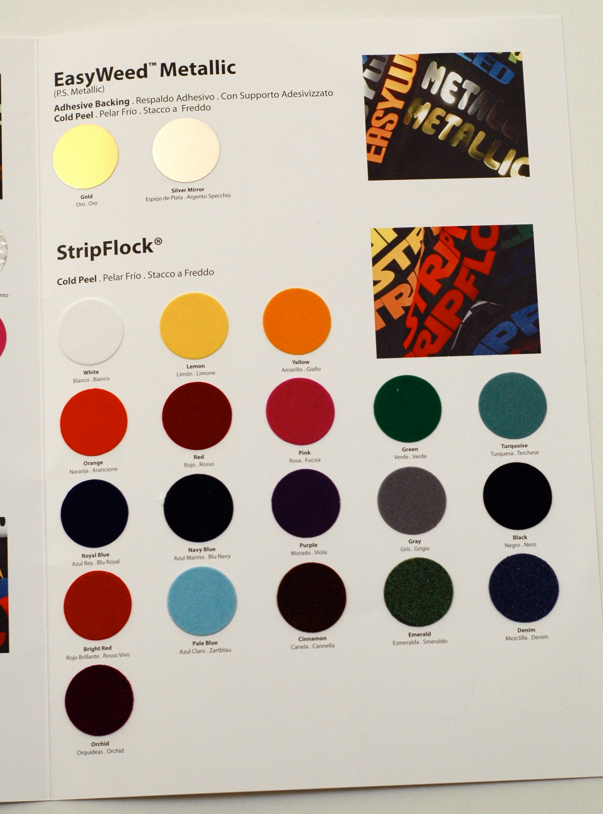
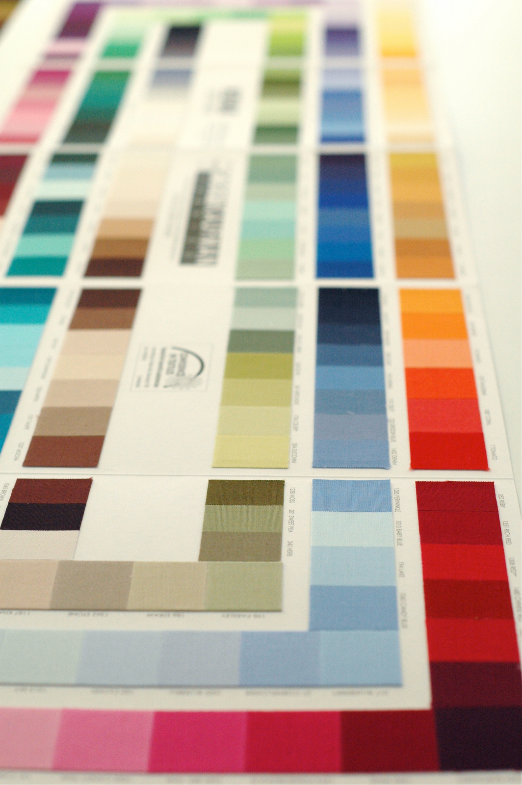
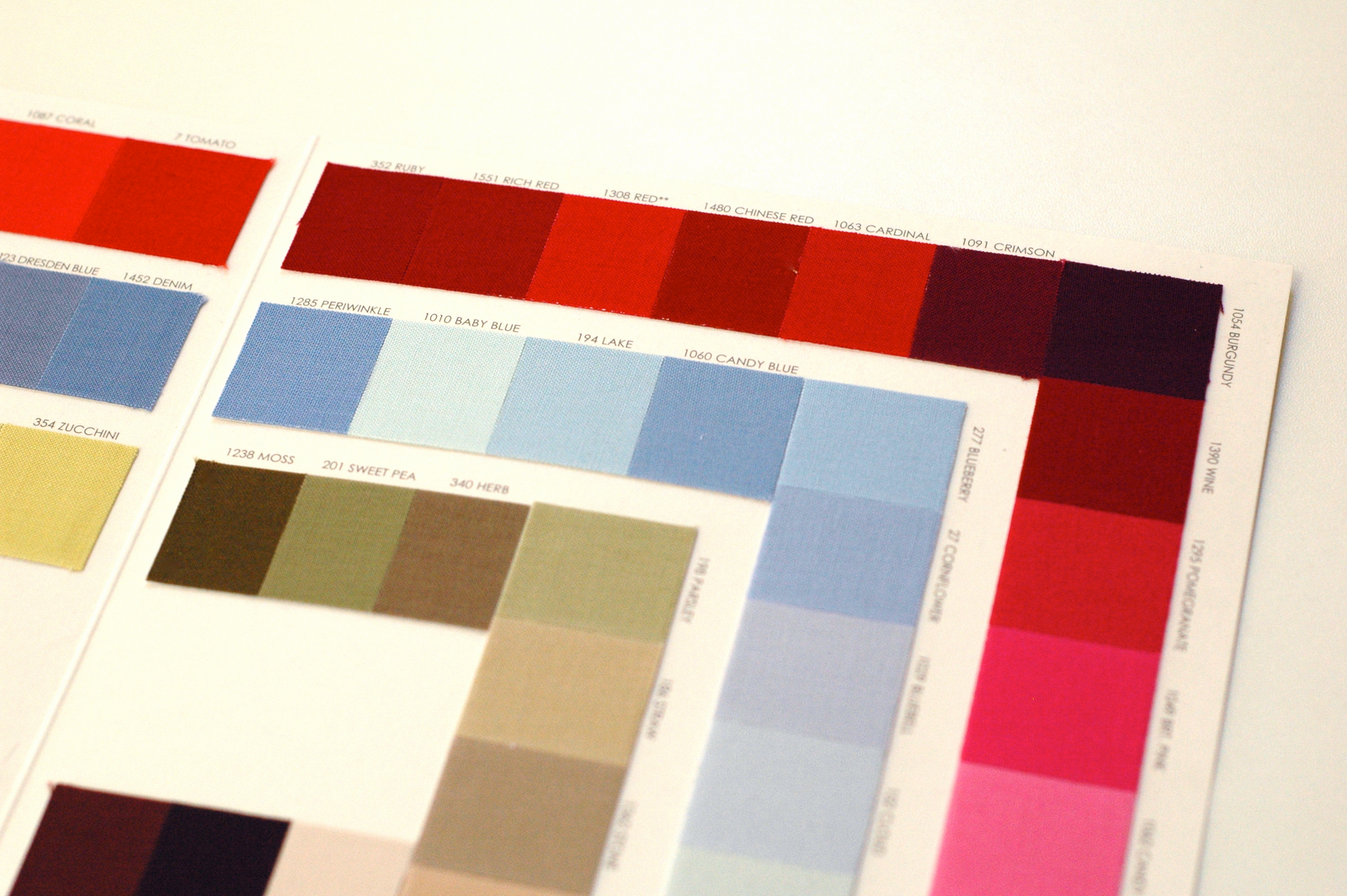
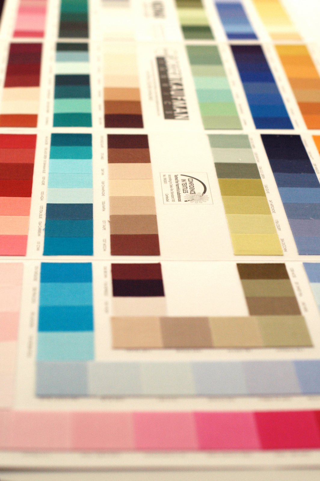
Each little square has the 6 hexadecimal characters underneath it that I need to match it in the digital file. Dizzying, yet infinitely helpful.

Not even sure what to say about it. I get lost in it.
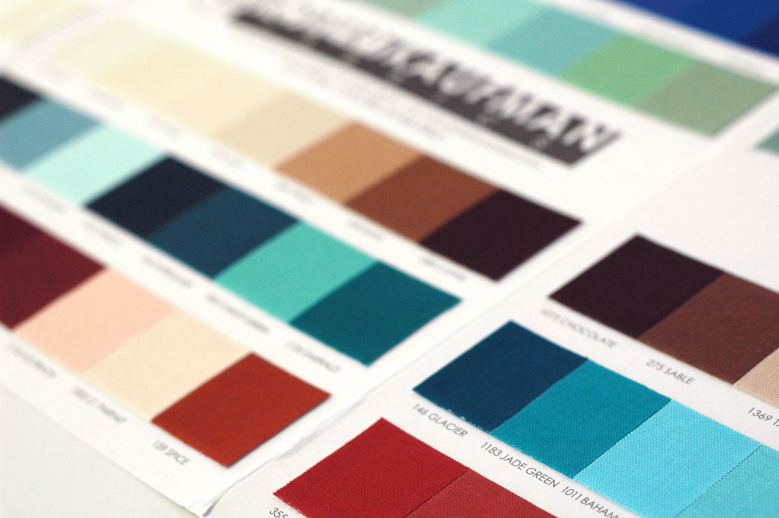
So far I’ve resisted the urge to buy one of the mega sets of fabric that has all of these colors in it, ’cause for me that would be crazy-over-the-top, but for selecting solids to match prints you already have, it’s fantastic.
I have to hide this from my children.
There are a few things a crafty mom just doesn’t have to share.


I think I *need* the second and third one there. Oh, and the Bella colour card, and perhaps the other solids one whose name I can’t think of right now… ;o)
Love the spoonflower one! :) (and your favorite tee descriptions).
My dad has a printing business. I worked there for a few years before I had kids. (Actually I still work there – only I clean the whole place every week and it’s not very glamorous – but it pays well.) My favourite was the PMS (pantone matching system – but I’m sure you know that already!) colour book/chart. Loved finding the perfect match! Also, paint colour sample boards! Love them too!
Yummy eye candy! The Spoonflower one is fabulous. I can see how it could be distracting. It’s nice to know I’m not the only one impressed by color charts. I ordered a set of felt squares from an Etsy shop recently and she sent an 8 X 11 page with samples of each felt color she sells. It’s been hanging above my sewing station and I have to say, the little gift was impressive. I’ll be ordering my felt from her from now on.
I’ve spent many hours flipping through the PMS book when I should have been doing something more productive.
I’ve spent many hours flipping through the PMS book when I should have been doing something more productive.
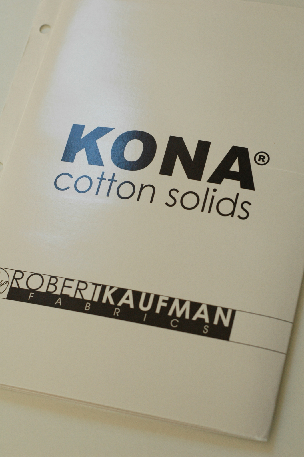
love this post I want them all… mom keeps talking about getting the kona cotton one and i just need to find it and order it already! The spoonflower one might be a necessity before I order design any more fabric!